

01 The problem
Utilities can't fix what they can't find
An electric utility in the US owns an enormous amount of physical stuff spread across a lot of ground. Poles of wood, steel and concrete, standing in weather. Calibrated test equipment worth thousands a unit, living in trucks. Warehouses of parts feeding crews who are rarely in them.
The failure mode isn't dramatic. It's a thermal imager nobody can locate, so a second one gets bought. It's a multimeter used for six months past its calibration date, so every reading it produced is now questionable. It's a leaning pole that was fine at the last inspection and won't be looked at again for a year.
N-Smart's answer was sensors, but a sensor is only as useful as the model underneath it. A tilt reading means nothing if you can't say which feeder the pole is on, who is responsible for that feeder, and which crew has the tools to go fix it. That model was V1, and that was my job.
02 Where the domain came from
Three years of domain knowledge, cashed in
I had spent about three years writing about grid modernisation, pole sensors and utility operations for N-Smart, an unglamorous but genuinely effective way to learn a domain most people have to be taught from scratch. So when V1 needed someone who already spoke utility, I pitched to run it. They said yes. Ganesh and I took it on together; I headed it.
Founders for the domain, field staff for the truth
The founders briefed me on the grid side: feeders, pole types, what a service center actually is. That got me the vocabulary. It did not get me the behaviour. For that I went to their on-field employees in the US directly, which is how the parts of V1 that aren't obvious got in: that a tool goes missing by being somewhere it shouldn't be rather than by vanishing, that a crew will switch off any alert they can't tune, that a truck is functionally a warehouse.
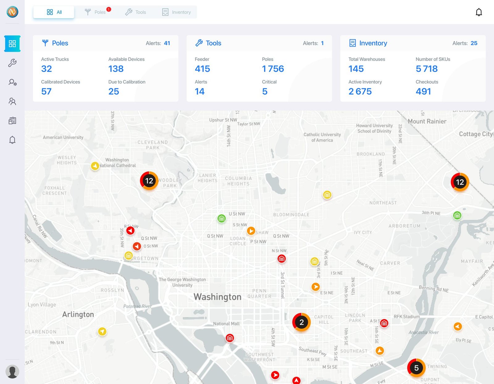
What this page is careful about. I owned the product thinking, the user stories, the flows and the wireframes. A separate agency did the visual design on top of that work. The finished screens below are theirs, drawn from my structure.
N-Smart's platform today sells an AI layer: risk scoring, predictive maintenance, a sense-think-act loop. That is V2 and it came after me. The customer logos on their site today are not from my period and I make no claim on them.
03 The structure
Everything lives under poles, tools or inventory
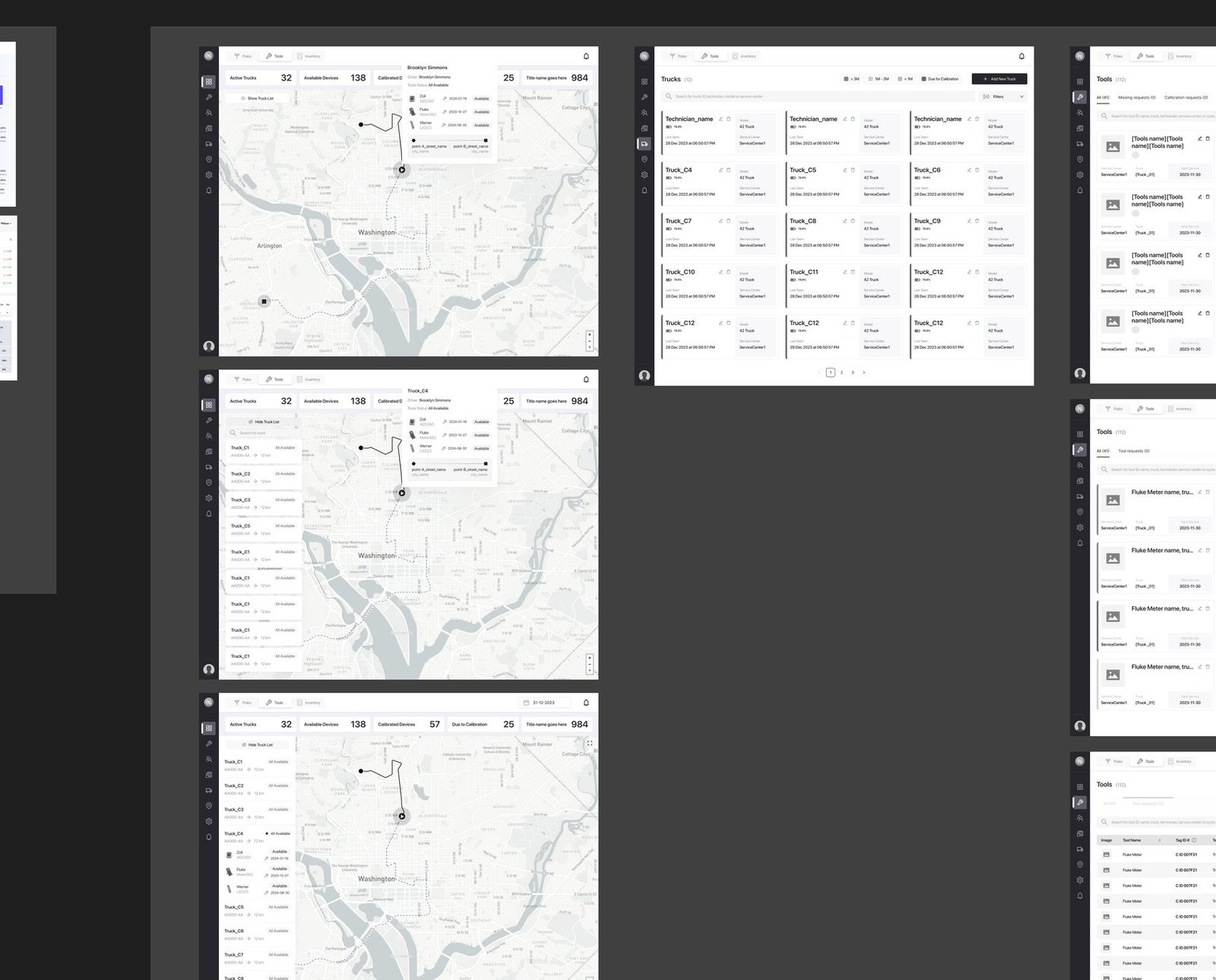
The diagrams below are a clean redraw of V1's architecture, made from the original wireframe board and the shipped interface. The board itself is the primary artefact. It's the thing I actually produced, and it looks like this:
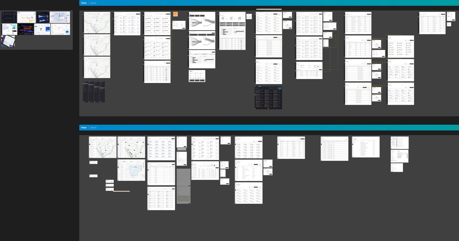
Three pillars and a rail
Everything in the product lives under Poles, Tools or Inventory, with a roll-up dashboard on top that summarises all three rather than becoming a fourth place things could hide. A left rail cuts across the pillars for the things you do: reports, users, service centers. Two axes, no orphans.
A truck is a warehouse that moves
The load-bearing decision. Everything belongs to a Service Center, not to the utility and not to a region, because that's the unit a crew actually reports to, so permissions, stock and tooling all inherit from one place.
And rather than build vehicles as their own thing, a truck is modelled as a warehouse with a driver and a route. One inventory model covers a building and a Ford F-350. It's why a truck can carry a manifest and raise a missing-tool flag without a second system existing to make that possible.
The tool loop, and the two states that cost money
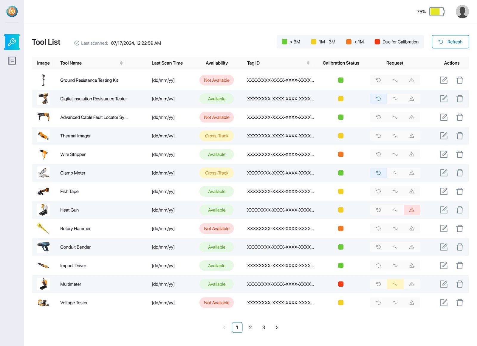
A tool is never simply present or absent. It's somewhere in a cycle. Available, requested, checked out, scanned back in. Running above that is a calibration ladder that flags equipment before it goes out of date rather than after.
The two states worth designing for are the expensive ones. Missing: no scan inside the window. And Cross-Track: scanned somewhere it doesn't belong, which is how tools actually disappear. Cross-Track is the state that stops the first from quietly becoming the second.
The pole loop, and why thresholds are tunable
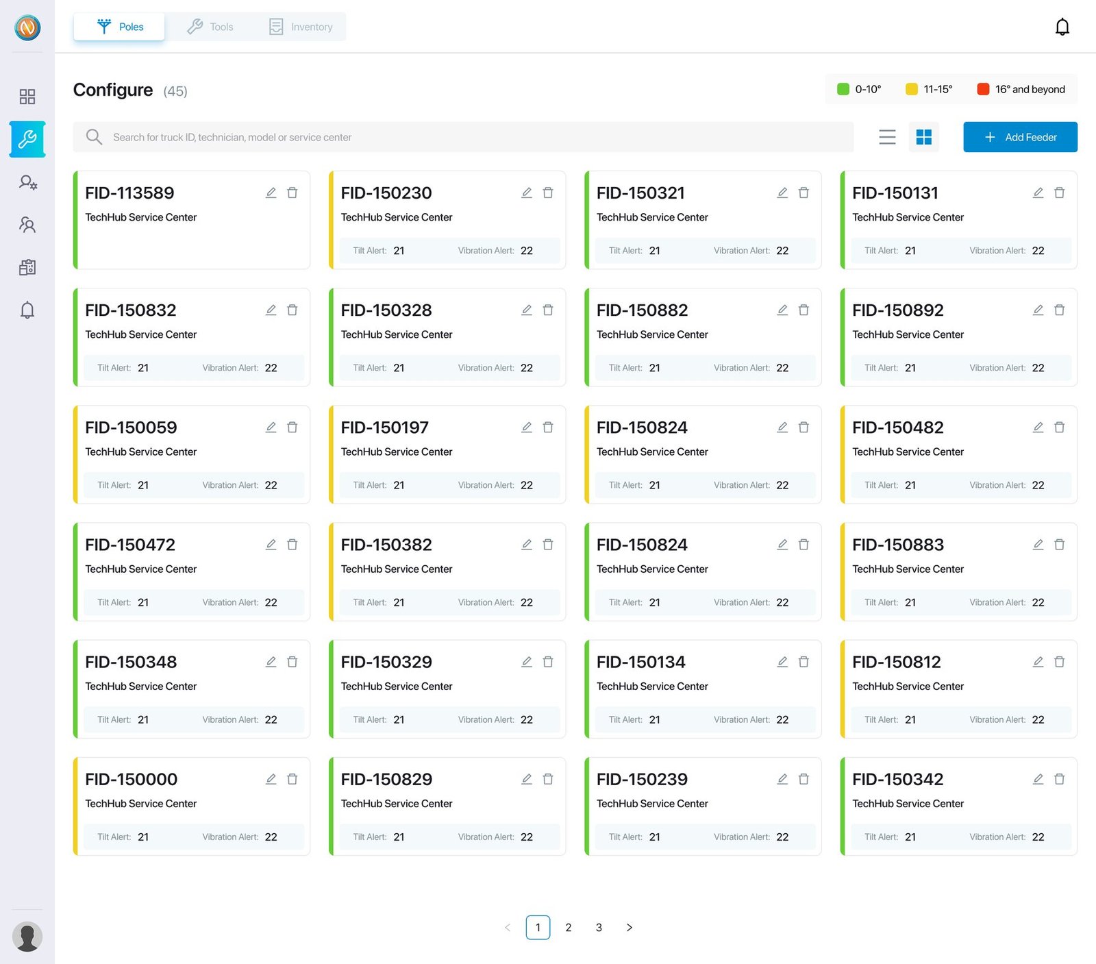
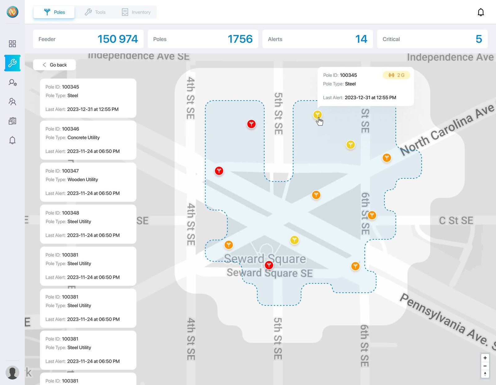
A pole reports deviation angle, vibration and battery. Those readings become alerts by crossing thresholds, and the thresholds are configured per feeder, not hard-coded. A pole on a coastal run and one on flat inland ground don't lean the same way. An operator who can't tune that will switch the alerts off inside a week, and then the sensors are decoration.
Three bands. Only two of them make work.
04 What it became
112 service centers and 1,756 poles in one model
The build covered 112 service centers, 145 warehouses, 415 feeders and 1,756 poles in the working data model, with five roles scoping who sees what.
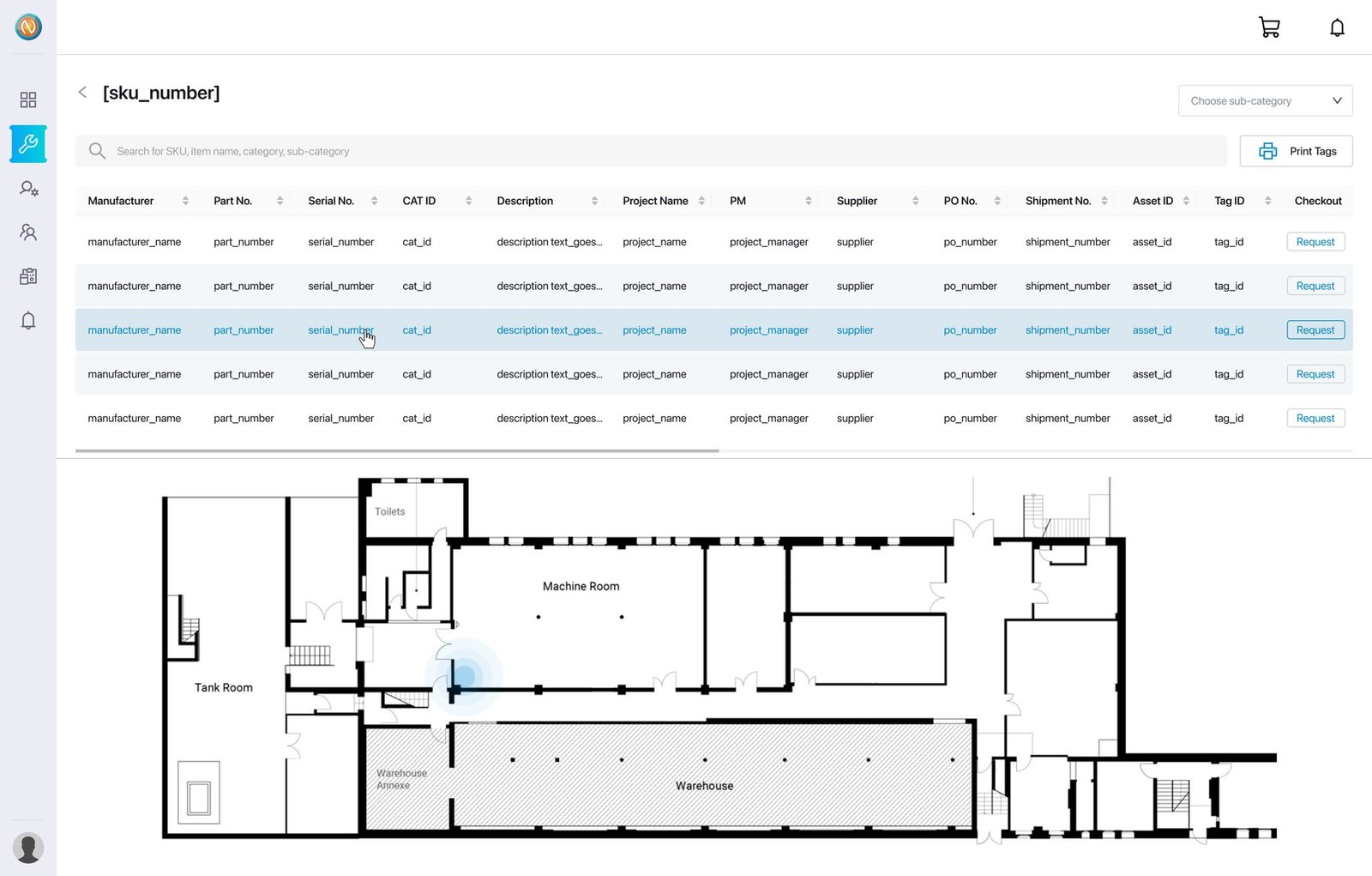
The place the board shows me changing my mind
Reports exists three times on the wireframe board. Twice as a Sankey diagram, with tool states flowing into a single total, and once as plain horizontal bars carrying exactly the same five numbers.
The Sankey is the better-looking drawing. It is also the worse answer: someone opening Reports wants to know how many tools are missing, not how the categories relate as flow volume.
05 What I took from it
Go to the person who does the job, then draw the screen
- Domain knowledge compounds sideways. Three years of marketing their product is why I could argue about feeders in week one instead of week six.
- Ask the people who carry the thing. Cross-Track, tunable thresholds and the truck model all came out of field staff, not out of the brief.
- The unglamorous layer is the one that has to be right. Everything N-Smart sells today runs on top of a model of poles, tools and service centers. Getting that model wrong in V1 would have been expensive in a way no AI layer could fix later.
- Know which part was yours. I did the thinking and the structure. Someone else made it beautiful, and someone else made it smart.
Nothing here was a method I brought in from somewhere. It was the habit of going to the person who actually does the job before deciding what the screen should say, which is the only part of this that transfers to every product I have worked on since.